
Bilder machen oft 50-70% des Seitengewichts aus. Ohne responsive Auslieferung laden mobile Nutzer unnötig grosse Dateien, die Core Web Vitals verschlechtern sich, und Google stuft die Seite herab. Rails bietet eingebaute Werkzeuge, um dieses Problem systematisch zu lösen.
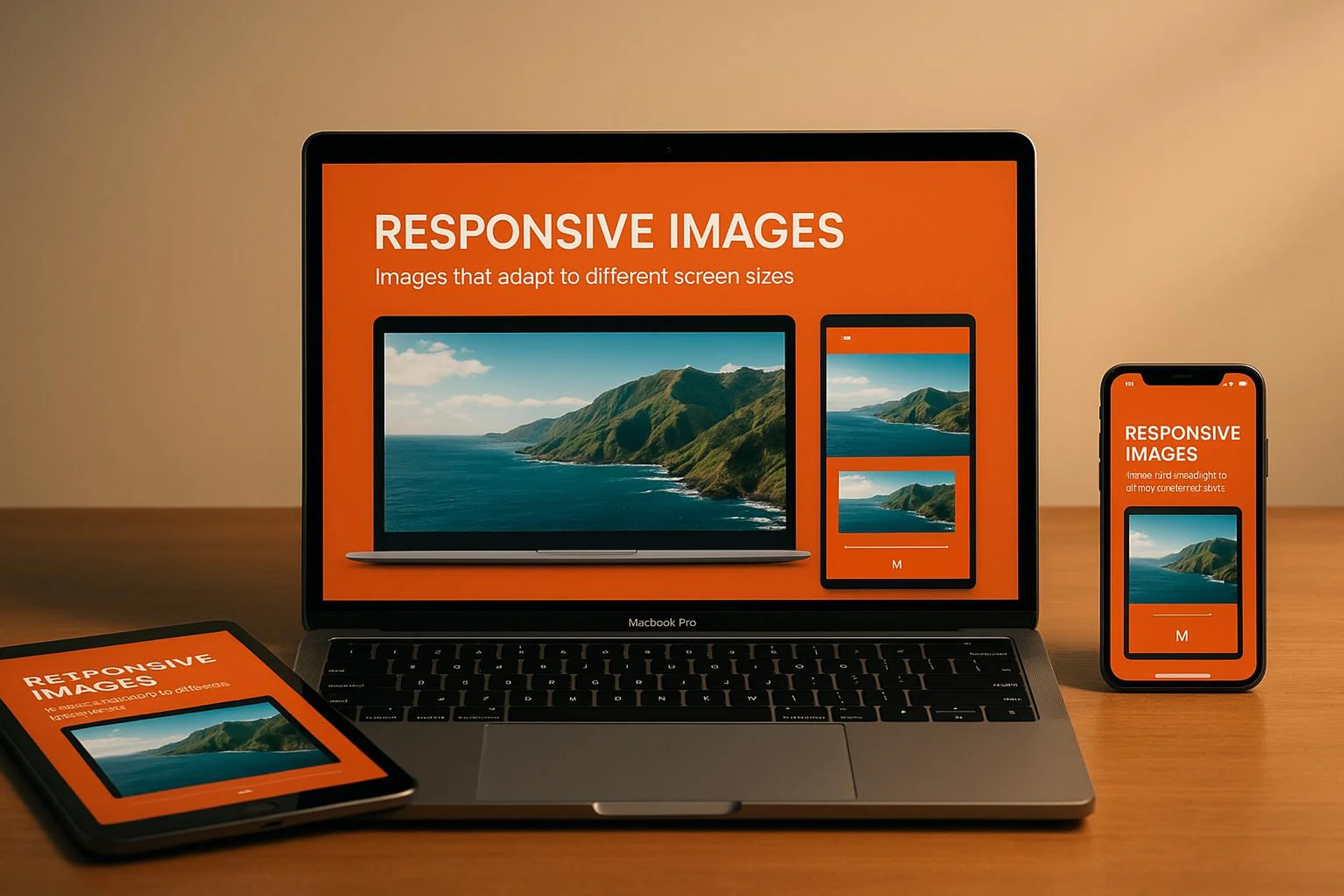
Machen Sie Ihre Seite blitzschnell mit reaktionsfähigen Bildern
Wie funktioniert srcset mit image_tag in Rails?
Seit Rails 5.2.1 unterstützt image_tag die Attribute srcset und sizes direkt. Der Browser wählt automatisch die passende Bildgrösse basierend auf Viewport und Pixeldichte:
image_tag("pic.jpg",
  srcset: [["pic_1024.jpg", "1024w"], ["pic_1980.jpg", "1980w"]],
  sizes: "(min-width: 650px) 50vw, 100vw"
)
Das sizes-Attribut steuert die Auswahl: Auf Bildschirmen ab 650px nimmt das Bild 50% der Breite ein, darunter 100%. Der mobile Datenverbrauch sinkt dadurch um bis zu 80%.
Retina-Displays: Wann lohnen sich 2x-Bilder?
Hochdichte Displays (DPR 2 oder höher) nutzen mehrere physische Pixel pro CSS-Pixel. Standard-1x-Bilder wirken unscharf. Rails unterstützt Pixel-Dichte-Descriptoren:
image_tag("icon.png",
  srcset: { "icon_2x.png" => "2x", "icon_4x.png" => "4x" }
)
Alles über 2x bringt kaum sichtbare Qualitätsgewinne. Konzentrieren Sie sich auf 2x für Logos, Icons und Text-Overlays.
Für CSS-Hintergrundbilder verwenden Sie Medienabfragen:
@media only screen and (-webkit-min-device-pixel-ratio: 2),
only screen and (min-resolution: 2dppx) {
    .logo {
        background-image: url('logo@2x.png');
        background-size: 200px 100px;
    }
}
Lazy Loading: Wann einsetzen, wann nicht?
Lazy Loading verzögert das Laden von Bildern, bis sie in den sichtbaren Bereich scrollen. Rails 6.1 macht die Umsetzung trivial:
<%= image_tag "hero.jpg", loading: "lazy", alt: "Hero image" %>Wichtig: Above-the-fold-Bilder (Hero, Logo) sollten loading="eager" verwenden. Lazy Loading dort verzögert den Largest Contentful Paint (LCP).
Welches CSS-Framework passt zu responsive Bildern in Rails?
Bootstrap bietet .img-fluid mit max-width: 100% und height: auto:
<%= image_tag "example.jpg", class: "img-fluid", alt: "Responsive image" %>Tailwind CSS nutzt einen Mobile-First-Ansatz mit Breakpoint-Präfixen:
<%= image_tag "profile.jpg", class: "w-16 md:w-32 lg:w-48", alt: "Profile" %>| Breakpoint | Min. Breite | CSS |
|---|---|---|
sm | 640px | @media (width >= 40rem) |
md | 768px | @media (width >= 48rem) |
lg | 1024px | @media (width >= 64rem) |
xl | 1280px | @media (width >= 80rem) |
Für präzise Kontrolle erstellen Sie eigene Medienabfragen mit CSS Custom Properties:
:root {
  --image-width: 300px;
  --grid-gap: 1rem;
}

@media screen and (min-width: 768px) {
  :root {
    --image-width: 450px;
    --grid-gap: 2rem;
  }
}

.image-grid {
  display: grid;
  grid-template-columns: repeat(auto-fit, minmax(var(--image-width), 1fr));
  gap: var(--grid-gap);
}
Fluid Sizing mit clamp() vermeidet zusätzliche Breakpoints:
.hero-image {
  width: clamp(320px, 100%, 1200px);
  height: clamp(200px, 50vh, 600px);
}
WebP, AVIF oder JPEG: Welches Format für welchen Einsatz?
Das <picture>-Element liefert das optimale Format je nach Browser-Unterstützung:
<picture>
  <source srcset="<%= image_path('hero.avif') %>" type="image/avif">
  <source srcset="<%= image_path('hero.webp') %>" type="image/webp">
  <%= image_tag 'hero.jpg', alt: 'Hero image', class: 'img-fluid' %>
</picture>| Format | Einsatz | Kompression | Support |
|---|---|---|---|
| JPEG | Fotos, Farbverläufe | Verlustbehaftet | Universell |
| PNG | Transparenz, scharfe Kanten | Verlustfrei, grösser | Universell |
| WebP | Allgemeine Webbilder | 25-35% kleiner als JPEG | Moderne Browser |
| AVIF | Hochwertige Bilder | Beste Kompression | Wachsend |
AVIF bietet die beste Kompression, unterstützt aber kein progressives Rendering. Immer JPEG als Fallback bereitstellen.
Wie komprimiert man Bilder effizient in der Rails-Pipeline?
Die image_optim Gem bietet verlustfreie Kompression über verschiedene Tools:
# Gemfile
gem 'image_optim'
gem 'image_optim_pack'
Für Upload-Pipelines mit CarrierWave:
class ImageUploader < CarrierWave::Uploader::Base
  include CarrierWave::ImageOptimizer
  process :optimize
  process quality: 85
end
Das Entfernen von EXIF-, IPTC- und ICC-Metadaten reduziert Dateigrössen um 20-30%.
Nutzer-Uploads sollten in Background Jobs verarbeitet werden:
class ProcessImageJob < ApplicationJob
  def perform(image_id)
    image = Image.find(image_id)
    ImageOptim.new.optimize_image!(image.file.path)
  end
end
Asset-Pipeline und Caching: Die letzte Meile der Optimierung
Rails 8 nutzt Propshaft als Standard-Pipeline mit Content-basiertem Fingerprinting:
<%= image_tag "product/hero.jpg", alt: "Product showcase" %>RAILS_ENV=production rails assets:precompileCache-Header in der Produktion setzen:
# config/environments/production.rb
config.public_file_server.headers = {
  "Cache-Control" => "public, max-age=31536000"
}
NGINX-Konfiguration für langfristiges Caching:
location ~* \.(jpg|jpeg|png|gif|ico|css|js)$ {
  expires 1y;
  add_header Cache-Control "public, immutable";
}
CDN-Integration für schnellere Auslieferung:
config.asset_host = "https://cdn.example.com"Wie testet man responsive Bilder zuverlässig?
Automatisierte Systemtests verifizieren das responsive Verhalten:
class MobileSystemTestCase < ApplicationSystemTestCase
  def setup
    super
    current_window.resize_to(375, 812)
  end
end

class ResponsiveImageTest < MobileSystemTestCase
  test "hero image loads correctly on mobile" do
    visit root_path
    hero_image = find('img[alt="Hero image"]')
    assert hero_image.present?
    assert hero_image['src'].include?('hero-mobile')
  end
end
Testen Sie auf diesen Schlüssel-Viewports:
| Gerät | Grösse | Typisch |
|---|---|---|
| Kleines Mobilgerät | 320x568 | Ältere iPhones |
| Modernes Mobilgerät | 390x844 | iPhone 14/15 |
| Tablet Hochformat | 768x1024 | iPad |
| Laptop | 1366x768 | Standard-Laptops |
| Desktop | 1920x1080 | Full HD |
Explizite Abmessungen verhindern Layout Shifts (CLS):
<%= image_tag "hero.jpg", width: 1200, height: 630, alt: "Hero" %>Barrierefreiheit: Alt-Texte systematisch prüfen
Jedes Bild braucht einen aussagekräftigen alt-Text. Dekorative Bilder erhalten alt="":
<%= image_tag "sales-chart.png", alt: "Umsatzwachstum 40% von Januar bis März 2024" %>
<%= image_tag "decorative-border.png", alt: "" %>
Automatisierte Tests finden fehlende Alt-Attribute:
test "all images have alt attributes" do
  visit page_path
  images_without_alt = page.all('img').select do |img|
    img['alt'].nil? || img['alt'].empty?
  end
  assert_empty images_without_alt
end
WCAG verlangt ein Kontrastverhältnis von 4,5:1 für normalen Text und 3:1 für grossen Text auf Bildern.
Praktische Umsetzung: Der USEO-Ansatz
In unseren Rails-Projekten setzen wir responsive Bilder nicht als Nachgedanken um, sondern als Teil der Build-Pipeline von Tag eins. Das spart später aufwändige Nacharbeiten.
Automatische Variantenerzeugung: Wir generieren bei jedem Upload über Active Storage automatisch Varianten in 3 Grössen (400w, 800w, 1600w) plus WebP- und AVIF-Versionen. Ein einziger Concern erledigt das für alle Models:
module HasResponsiveImage
  extend ActiveSupport::Concern

  included do
    has_one_attached :image do |attachable|
      attachable.variant :small, resize_to_limit: [400, nil]
      attachable.variant :medium, resize_to_limit: [800, nil]
      attachable.variant :large, resize_to_limit: [1600, nil]
    end
  end
end
Performance-Budget im CI: Wir integrieren derailed_benchmarks in die CI-Pipeline mit einem klaren Limit: Kein Bild darf unkomprimiert über 200 KB sein. Überschreitungen blockieren den Merge.
Lighthouse-Gates: Vor jedem Deploy prüft ein automatisierter Lighthouse-Run die Core Web Vitals. Ein LCP über 2,5 Sekunden stoppt das Deployment. So verhindern wir Performance-Regressionen, bevor sie in Produktion landen.
Pragmatischer Fallback: Für ältere Browser ohne AVIF/WebP-Support liefern wir optimierte JPEGs mit quality: 80 aus. Kein Nutzer sieht ein kaputtes Bild.
FAQs
Wie optimiere ich responsive Bilder in Rails für Leistung und Barrierefreiheit?
Nutzen Sie srcset und sizes im image_tag für verschiedene Bildschirmgrössen. Liefern Sie WebP als Standardformat mit JPEG-Fallback. Komprimieren Sie alle Bilder mit image_optim und setzen Sie auf jedes Bild einen aussagekräftigen alt-Text.
Welche Vorteile bieten WebP und AVIF gegenüber JPEG?
WebP liefert 25-35% kleinere Dateien bei vergleichbarer Qualität. AVIF erreicht noch bessere Kompression und unterstützt HDR sowie Transparenz. Beide Formate verbessern die Ladezeiten messbar, benötigen aber JPEG als Fallback für ältere Browser.
Was bringt Lazy Loading konkret?
Lazy Loading verzögert das Laden von Bildern ausserhalb des sichtbaren Bereichs. Die initiale Ladezeit sinkt, der Bandbreitenverbrauch reduziert sich. In Rails reicht loading: "lazy" im image_tag. Above-the-fold-Bilder sollten davon ausgenommen werden.