
UI inconsistency is a code smell. When the same button looks different across three pages, it signals duplicated templates, scattered CSS, and a codebase where every developer solves the same problem differently. A design system fixes this at the architectural level by creating a single source of truth for every visual element.
Why do Rails apps drift into visual inconsistency?
Rails’ view layer encourages copying partials and inline styles. Over time, a project accumulates multiple button implementations, inconsistent spacing, and conflicting color values. The cost compounds: every new feature requires designers to specify what already exists, and every code review catches yet another hardcoded hex value.
The fix is structural. Define visual primitives (colors, spacing, typography) as tokens, build reusable components from those tokens, and enforce usage through convention and tooling.
Measurable impact:
- Teams report up to 47% faster feature development with mature design systems
- UI-related bugs drop by ~30% when components are centralized
- Onboarding new developers becomes faster when patterns are documented and consistent
Rails 8 + AI + Tailwind The Ultimate Design System Tutorial 2024
What are the core principles behind a Rails design system?
Three principles keep a design system maintainable:
Modularity. Each View Component manages its own styling and behaviour. Changing a navigation bar never accidentally breaks a form field. Components are self-contained units with defined inputs and outputs.
Atomic design. Structure UI elements in a hierarchy: atoms (buttons, inputs) combine into molecules (search bars, card headers), which form organisms (navigation, dashboards). Each level has a clear role and relationship.
Reusability. A single button component handles all sizes, colors, and states through props rather than duplication. One definition, many configurations:
class CustomButtonComponent < ViewComponent::Base
  def initialize(label:, style: :primary, size: :medium, **options)
    @label = label
    @style = style
    @size = size
    @options = options
  end

  private

  attr_reader :label, :style, :size, :options
end
How do design tokens eliminate hardcoded values?
Design tokens are named variables that store visual decisions. Instead of scattering #dc143c across your codebase, you reference --color-primary. Changes propagate everywhere instantly.
// config/_variables.scss
// Colors
--color-primary: #dc143c;
--color-secondary: #ffffff;
--color-accent: #2c3e50;
--color-success: #27ae60;
--color-warning: #f39c12;
--color-error: #e74c3c;

// Typography
--font-primary: 'Helvetica Neue', Arial, sans-serif;
--font-size-base: 1rem;
--font-size-large: 1.25rem;
--font-size-small: 0.875rem;

// Spacing (8px system)
--space-xs: 0.25rem;
--space-s: 0.5rem;
--space-m: 1rem;
--space-l: 1.5rem;
--space-xl: 2rem;
Organize your stylesheet directory to reflect the system hierarchy:
app/assets/stylesheets/
├── config/
│   ├── _variables.scss
│   └── _mixins.scss
├── components/
│   ├── _buttons.scss
│   ├── _forms.scss
│   └── _navigation.scss
├── layouts/
│   ├── _header.scss
│   ├── _footer.scss
│   └── _grid.scss
└── application.scss
Use BEM naming (block__element--modifier) to avoid class conflicts and keep styles navigable for the team.
Which tools form the Rails design system stack?
Primer View Components
GitHub’s Primer Design System provides pre-built, accessible components for Rails:
gem 'primer_view_components'yarn add @primer/view-components @primer/css @primer/primitivesEnable in config/application.rb:
require "view_component"
require "primer/view_components"
Primer components handle ARIA attributes, keyboard navigation, and color contrast out of the box. Instead of building accessible buttons, alerts, and navigation from scratch, you get tested implementations that follow established patterns.
Note: Primer is pre-1.0, so breaking changes may occur between versions. Pin your version and test thoroughly before upgrading.
Tailwind CSS for utility-first styling

Tailwind maps your design tokens to utility classes. Configure it to reflect your system:
module.exports = {
  content: [
    './app/views/**/*.html.erb',
    './app/helpers/**/*.rb',
    './app/components/**/*.rb'
  ],
  theme: {
    extend: {
      colors: {
        primary: '#dc143c',
        secondary: '#2c3e50'
      },
      spacing: {
        '18': '4.5rem',
        '88': '22rem'
      }
    }
  }
}
Tailwind works especially well alongside View Components. Components define structure and behaviour; Tailwind utilities handle visual styling with consistent tokens.
Hotwire and Turbo for interactivity without JavaScript frameworks
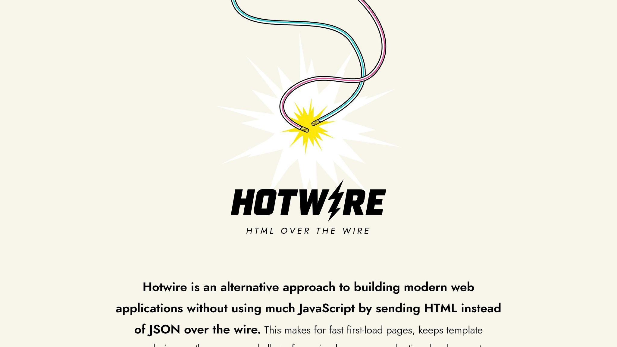
Turbo Streams and Turbo Frames enable real-time UI updates using server-rendered HTML. The key advantage: UI logic stays centralized in Rails views and components. Updates preserve the styling and behaviour defined in your design system because they use the same server-side templates.
This declarative approach prevents the drift that occurs when frontend JavaScript frameworks maintain their own component state and styling independent of the backend.
How do you handle accessibility and i18n in components?
Accessibility should be built into components from the start, not bolted on later.
Accessibility checklist per component:
- Keyboard navigation for all interactive elements
- ARIA attributes and semantic HTML by default
- Color contrast meeting WCAG 2.1 AA standards
- Alternative text for images, proper form labels, logical tab order
i18n considerations for multilingual apps:
| Format Type | Standard | Example |
|---|---|---|
| Date | DD.MM.YYYY | 15.03.2024 |
| Currency | CHF with apostrophe | CHF 1’234.50 |
| Numbers | Apostrophe thousands | 1’234.50 |
Components must handle text expansion gracefully. German text is typically 30% longer than English. Design flexible layouts that accommodate varying string lengths without breaking.
Use Rails locale-aware helpers and translation files for consistent formatting. Build components with min-width rather than fixed widths to handle different languages naturally.
How do you maintain a design system as the app grows?
Version control every change
Semantic versioning tracks the system’s evolution:
- Increasing button padding = minor version change
- Removing a component prop = major version + migration guide
Your Git repository houses component code, design tokens, documentation, and examples as a single source of truth.
Document usage, not just API
Good documentation explains when and why to use a component, not just how. Tools like Storybook generate living style guides directly from ViewComponent code, ensuring documentation stays current as components evolve.
Update legacy views incrementally
Instead of rewriting all views at once, start with shared UI elements (buttons, form inputs, navigation) that appear across many pages. Replace them one component at a time. Use automated visual regression testing to catch unintended changes during migration.
Enforce through code review and tooling
Linters catch custom styles that should use design system components. Visual regression testing frameworks act as safety nets. Code reviews reinforce patterns by flagging deviations early.
Practical Implementation: The USEO Approach
Design systems are not academic exercises. They solve concrete problems in production applications that evolve over years.
On the Yousty HR portal, we maintain a Rails application that has been in continuous development for 13 years. The design system evolved incrementally: we started with shared partials, migrated to View Components when the library matured, and introduced Tailwind CSS for utility-first styling when the team grew. The critical lesson was that a design system does not need to be complete before it delivers value. Starting with the 10 most-used components (buttons, form fields, cards, tables, navigation items) covered roughly 80% of the UI surface area. Each new component was added only when duplication was detected in code review.
For Triptrade, a travel platform MVP, we took a different approach. Speed to market demanded using Primer View Components as a pre-built foundation rather than building custom components. The trade-off was less visual uniqueness in exchange for faster delivery. We customized Primer’s design tokens to match the brand identity and layered Tailwind utilities for layout-specific needs. The MVP launched with a consistent UI despite a compressed timeline because the design system eliminated per-page styling decisions.
Component audit process we follow:
- Inventory - Screenshot every unique UI pattern across the application
- Categorize - Group by function (navigation, forms, data display, feedback)
- Deduplicate - Identify patterns that differ visually but serve the same purpose
- Prioritize - Start with components that appear on the most pages
- Build and replace - Create the View Component, write tests, swap out old implementations one page at a time
The most common mistake we see in legacy Rails modernization is attempting to introduce a design system and a major Rails upgrade simultaneously. These are separate concerns. Stabilize the design system on the current Rails version first, then upgrade. Trying to do both at once creates debugging ambiguity when something breaks.
FAQs
How does a design system improve collaboration between designers and developers?
A design system provides a shared vocabulary. When a designer specifies “primary button, large size,” both the designer and developer reference the same component with the same visual output. This eliminates interpretation differences and reduces review cycles. Developers focus on business logic while the design system handles visual consistency automatically.
What is the minimum viable design system for a new Rails project?
Start with design tokens (colors, typography, spacing) and five components: button, text input, card, navigation item, and alert. These cover the majority of UI patterns in a typical Rails application. Add components only when you detect duplication in code review.
How do Primer View Components and Tailwind CSS work together?
Primer provides accessible, pre-built components with defined structure and behaviour. Tailwind provides utility classes for layout, spacing, and customization. Use Primer for interactive elements (buttons, dropdowns, dialogs) and Tailwind for page layout and component arrangement. The two complement each other without overlap.