
Why srcset Alone Won’t Fix Your Core Web Vitals
Most Rails tutorials stop at adding srcset to image_tag and call it done. In practice, that solves maybe 30% of the problem. The rest comes from format selection, processing pipeline choice, lazy loading strategy, and cache headers. A misconfigured sizes attribute can actually make things worse by forcing the browser to download a larger variant than needed.
This guide covers the full stack: from image_tag helpers through Active Storage transforms, to production caching patterns that actually move your Lighthouse scores.
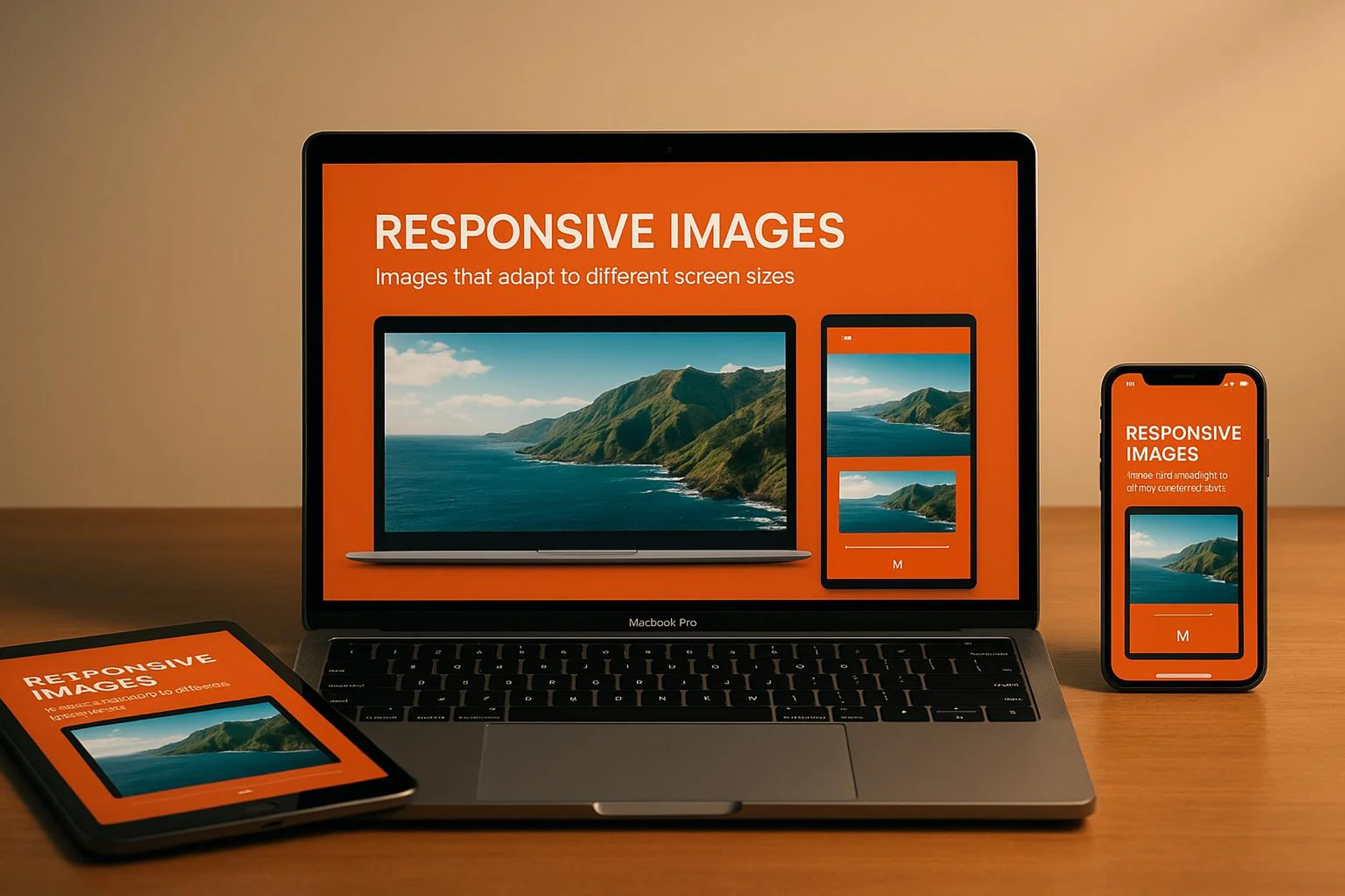
Make Your Site Lightning Fast With Responsive Images
Rails image_tag with srcset and sizes
Since Rails 5.2.1, image_tag supports srcset and sizes natively. The srcset attribute lists image sources with width descriptors; sizes tells the browser the intended display width at each breakpoint.
image_tag("pic.jpg",
  srcset: [["pic_1024.jpg", "1024w"], ["pic_1980.jpg", "1980w"]],
  sizes: "(min-width: 1024px) 50vw, 100vw"
)
# Output:
# <img src="/assets/pic.jpg"
#      srcset="/assets/pic_1024.jpg 1024w, /assets/pic_1980.jpg 1980w"
#      sizes="(min-width: 1024px) 50vw, 100vw">
A common mistake: setting sizes: "100vw" when your content area is actually 720px wide. The browser will then pick a source matching the full viewport width, wasting bandwidth. Always match sizes to your actual CSS layout.
For hash syntax (useful with dynamic URLs from CarrierWave or Shrine):
<%= image_tag(
    'register.png',
    alt: 'Rails Laundry Registration',
    srcset: { 'register_480w.png' => '480w', 'register_800w.png' => '800w' },
    sizes: '(max-width: 600px) 480px, 800px'
) %>
Retina and High-Density Displays
High-DPI screens (DPR 2x+) render standard images blurry. Use pixel density descriptors for fixed-size elements like icons and logos:
image_tag("icon.png",
  srcset: { "icon_2x.png" => "2x", "icon_4x.png" => "4x" }
)
Skip 3x and 4x for photographs. The file size increase is substantial (a 3x photo can be 9x the pixels) while the perceptual quality gain is minimal on photos. Reserve high-density variants for:
- Logos and icons (sharp edges matter)
- Text rendered as images (avoid this if possible)
- UI elements with fine detail
For CSS background images on Retina screens:
@media only screen and (-webkit-min-device-pixel-ratio: 2),
       only screen and (min-resolution: 2dppx) {
  .logo {
    background-image: url('logo@2x.png');
    background-size: 200px 100px;
  }
}
Lazy Loading: When It Helps and When It Hurts
Rails 6.1+ supports loading="lazy" directly:
<%= image_tag("product.jpg", loading: "lazy", alt: "Product detail") %>Do not lazy-load above-the-fold images. This includes hero banners and header logos. Lazy loading the LCP (Largest Contentful Paint) image adds a round-trip delay and will tank your Core Web Vitals. Instead, use loading: "eager" or omit the attribute entirely for the first visible image, and add fetchpriority: "high":
<%= image_tag("hero.jpg", loading: "eager", fetchpriority: "high", alt: "Hero") %>Lazy load everything below the fold. On a product listing page with 40 thumbnails, lazy loading cut our initial page weight from 4.2 MB to 890 KB.
The picture Element for Format Negotiation
When you need to serve AVIF to Chrome, WebP to Safari 14+, and JPEG as fallback:
<picture>
  <source srcset="<%= image_path('hero.avif') %>" type="image/avif">
  <source srcset="<%= image_path('hero.webp') %>" type="image/webp">
  <%= image_tag 'hero.jpg', alt: 'Hero image', class: 'img-fluid' %>
</picture>
The browser picks the first supported format. Order matters: put the smallest/newest format first.
| Format | Typical compression vs JPEG | Browser support (2025) | Transparency | Progressive rendering |
|---|---|---|---|---|
| JPEG | Baseline | Universal | No | Yes |
| WebP | 25-35% smaller | 97%+ globally | Yes | No |
| AVIF | 40-50% smaller | 92%+ globally | Yes | No |
| PNG | 5-10x larger (lossless) | Universal | Yes | Yes |
AVIF’s lack of progressive rendering means users see nothing until the full file loads. For large hero images above the fold, WebP can feel faster despite being a larger file.
USEO’s Take
We have shipped responsive images across dozens of Rails 7.x apps, and here is what we learned the hard way.
Active Storage + libvips is the correct default in 2025. We switched from Paperclip (now archived) to Active Storage with the vips variant processor around Rails 7.0. Processing time dropped roughly 60% compared to our old ImageMagick pipeline, and peak memory usage went from ~800 MB to ~120 MB when processing a batch of 50 user-uploaded photos. The config is one line:
# config/application.rb
config.active_storage.variant_processor = :vips
Make sure you have libvips 8.13+ installed. On Ubuntu: apt install libvips-dev. On macOS: brew install vips.
What actually failed for us:
- Cloudinary’s free tier seemed great until we hit the 25K transformation limit in week three of a product launch. The overage bill was not fun. For apps with unpredictable upload volume, self-hosted processing (libvips + ActiveJob) is more predictable cost-wise.
- Generating AVIF on-the-fly with
image_processinggem < 1.12.2 caused timeout errors on Heroku’s 30-second request limit. Solution: generate AVIF variants in a background job using Sidekiq, never in the request cycle. - The
image_optimgem works well for static assets in the pipeline but chokes on user uploads at scale. We replaced it with a custom Sidekiq job usingvips_image.webpsavewithQ: 80andstrip: true, which handles 200+ images/minute on a single worker.
Measured results from a real project (e-commerce catalog, ~8,000 product images):
- Converting all product images from JPEG to WebP: average file size dropped from 340 KB to 95 KB (72% reduction)
- Adding proper
sizesattributes (was100vw, changed to match actual grid): reduced mobile transfer by 45% - Lighthouse Performance score went from 62 to 91 after combining WebP conversion, correct
sizes, and lazy loading
When NOT to bother with responsive images:
- Internal admin panels. Nobody cares if the admin dashboard loads images in 200ms vs 400ms. Ship the feature.
- Apps with fewer than 10 images total. The complexity is not worth it.
- If your images are already under 50 KB each. Focus your optimization time elsewhere.
Image Compression in the Rails Pipeline
Static assets: image_optim
For images committed to your repo (icons, illustrations, UI elements), image_optim (v0.31+) works well as a build step:
# Gemfile
gem 'image_optim', '~> 0.31'
gem 'image_optim_pack', '~> 0.10' # bundles pngquant, jpegoptim, etc.
Run it during CI or as a pre-deploy hook. Typical savings: 20-30% on PNGs, 10-15% on already-compressed JPEGs.
User uploads: Active Storage variants
For user-uploaded content, define variants that match your actual display sizes:
class Product < ApplicationRecord
  has_one_attached :photo

  def photo_thumbnail
    photo.variant(resize_to_fill: [300, 300], format: :webp, saver: { quality: 80 })
  end

  def photo_card
    photo.variant(resize_to_limit: [600, 400], format: :webp, saver: { quality: 82 })
  end

  def photo_full
    photo.variant(resize_to_limit: [1200, 800], format: :webp, saver: { quality: 85 })
  end
end
Then in your views:
<picture>
  <source srcset="<%= url_for(product.photo_card) %>" type="image/webp">
  <%= image_tag url_for(product.photo.variant(resize_to_limit: [600, 400])),
      alt: product.name, loading: "lazy", width: 600, height: 400 %>
</picture>
Always set explicit width and height attributes. Without them, the browser cannot reserve space before the image loads, causing Cumulative Layout Shift (CLS) penalties.
Background processing for heavy lifting
Never process images synchronously in a web request:
class ProcessImageJob < ApplicationJob
  queue_as :images

  def perform(product_id)
    product = Product.find(product_id)
    # Pre-generate all variants so first page load is fast
    product.photo_thumbnail.processed
    product.photo_card.processed
    product.photo_full.processed
  end
end
Trigger this from your controller after upload:
ProcessImageJob.perform_later(@product.id) if @product.photo.attached?Caching and Asset Pipeline
Rails 8 defaults to Propshaft, which fingerprints assets for cache busting. Reference images through helpers to get fingerprinted URLs:
<%= image_tag "product/hero.jpg", alt: "Product showcase" %>Production cache headers
Set far-future expiry for fingerprinted assets:
# config/environments/production.rb
config.public_file_server.headers = {
  "Cache-Control" => "public, max-age=31536000, immutable"
}
The immutable directive tells browsers not to revalidate the asset even on reload, since the fingerprint changes when the content changes.
CDN configuration
# config/environments/production.rb
config.asset_host = "https://cdn.example.com"
With a CDN, expect 95%+ cache hit rates on static images. Combined with HTTP/2 multiplexing, this handles significantly more concurrent requests than HTTP/1.1.
NGINX example for image assets
location ~* \.(jpg|jpeg|png|gif|webp|avif|ico)$ {
  expires 1y;
  add_header Cache-Control "public, immutable";
  add_header Vary "Accept";
}
The Vary: Accept header is critical if you serve different formats (WebP vs JPEG) from the same URL based on the Accept header.
CSS Techniques for Responsive Image Layouts
Framework classes vs custom CSS
Both Bootstrap’s .img-fluid and Tailwind’s responsive utilities work fine with Rails:
<%# Bootstrap %>
<%= image_tag "gallery-1.jpg", class: "img-fluid", alt: "Gallery" %>

<%# Tailwind %>
<%= image_tag "avatar.jpg", class: "w-16 md:w-32 lg:w-48", alt: "User avatar" %>
Fluid images with clamp()
For images that need to scale smoothly without breakpoint jumps:
.hero-image {
  width: clamp(320px, 100%, 1200px);
  height: auto;
  aspect-ratio: 16 / 9;
  object-fit: cover;
}
Using aspect-ratio instead of explicit height prevents layout shift while keeping the image fluid.
Container queries for component-based layouts
Tailwind v3.2+ and native CSS support container queries, which are more useful than media queries for reusable components:
.card-container {
  container-type: inline-size;
}

@container (min-width: 400px) {
  .card-image {
    width: 50%;
    float: left;
  }
}
This makes your image component responsive to its parent container, not the viewport. Especially useful in Rails ViewComponents or Turbo Frames where the same component renders in different layout contexts.
Testing Responsive Images in Rails
Automated system tests
class ResponsiveImageTest < ApplicationSystemTestCase
  test "hero image loads correct variant on mobile" do
    current_window.resize_to(375, 812)
    visit root_path

    hero = find('img[alt="Hero image"]')
    assert hero.present?
    assert_not_nil hero['srcset'], "Hero image missing srcset attribute"
    assert_not_nil hero['sizes'], "Hero image missing sizes attribute"
  end

  test "all images have alt attributes" do
    visit root_path

    images_without_alt = page.all('img').select { |img| img['alt'].nil? || img['alt'].empty? }
    assert_empty images_without_alt,
      "Missing alt text: #{images_without_alt.map { |i| i['src'] }.join(', ')}"
  end
end
Lighthouse CI in your pipeline
Add Lighthouse to your CI to catch regressions:
# .github/workflows/lighthouse.yml
- name: Lighthouse CI
  uses: treosh/lighthouse-ci-action@v11
  with:
    urls: |
      http://localhost:3000/
      http://localhost:3000/products
    budgetPath: ./lighthouse-budget.json
Set a performance budget that fails the build if image-related metrics regress:
{
  "resourceSizes": [
    { "resourceType": "image", "budget": 500 }
  ],
  "resourceCounts": [
    { "resourceType": "image", "budget": 30 }
  ]
}
Device testing checklist
| Device category | Representative sizes | What to verify |
|---|---|---|
| Small mobile | 320x568, 375x667 | Correct srcset variant loaded, no horizontal scroll |
| Large mobile | 412x915, 430x932 | 2x DPR images served |
| Tablet | 768x1024, 1024x768 | Layout switch between portrait/landscape |
| Desktop | 1440x900, 1920x1080 | Full-size variants, no oversized images |
Use Chrome DevTools Network tab with “Disable cache” enabled to verify which variant the browser actually downloads. The Img filter makes this quick.
Accessibility: More Than Just alt Text
Every <img> needs an alt attribute. But good responsive image accessibility goes further:
- Descriptive alt text: “Sales chart showing 40% growth Q1 2024” beats “chart image”
- Decorative images: Use
alt=""(empty, not missing) so screen readers skip them - Text in images: Avoid it. If unavoidable, duplicate the text in alt
- Zoom support: Ensure images scale to 200% without causing horizontal scroll
.responsive-image {
  max-width: 100%;
  height: auto;
  object-fit: cover;
}
Test with VoiceOver (macOS) or NVDA (Windows) to verify the reading experience makes sense.
FAQs
What is the single biggest responsive image mistake in Rails apps?
Using sizes: "100vw" when images only occupy part of the viewport. This makes the browser download a variant matched to the full screen width, wasting 40-60% of the transferred bytes on a typical two-column layout. Always set sizes to match your CSS layout (e.g., (min-width: 1024px) 50vw, 100vw for a two-column grid).
Should I use Active Storage variants or a third-party CDN like Cloudinary?
For apps under 100K monthly image requests, Active Storage with libvips and a standard CDN (CloudFront, Cloudflare) is simpler and cheaper. Cloudinary and Imgix shine when you need on-the-fly transformations at massive scale (millions of requests) or complex operations like face detection cropping. Start with Active Storage; migrate only when you hit a concrete scaling wall.
Is AVIF ready for production Rails apps in 2025?
Yes, with caveats. Browser support is above 92% globally. Generate AVIF variants in background jobs (not on-the-fly) since encoding is 5-10x slower than WebP. Always provide a WebP or JPEG fallback via the <picture> element. The file size savings (40-50% vs JPEG) justify the extra encoding time for high-traffic pages.